-
Brand Identity
Brand guidelines
Logo design
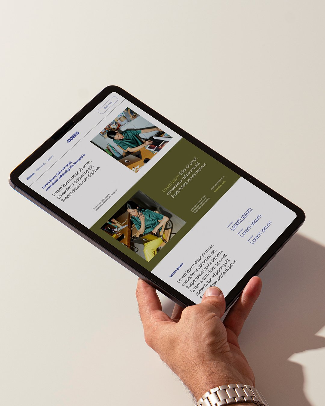
Presentation design
-
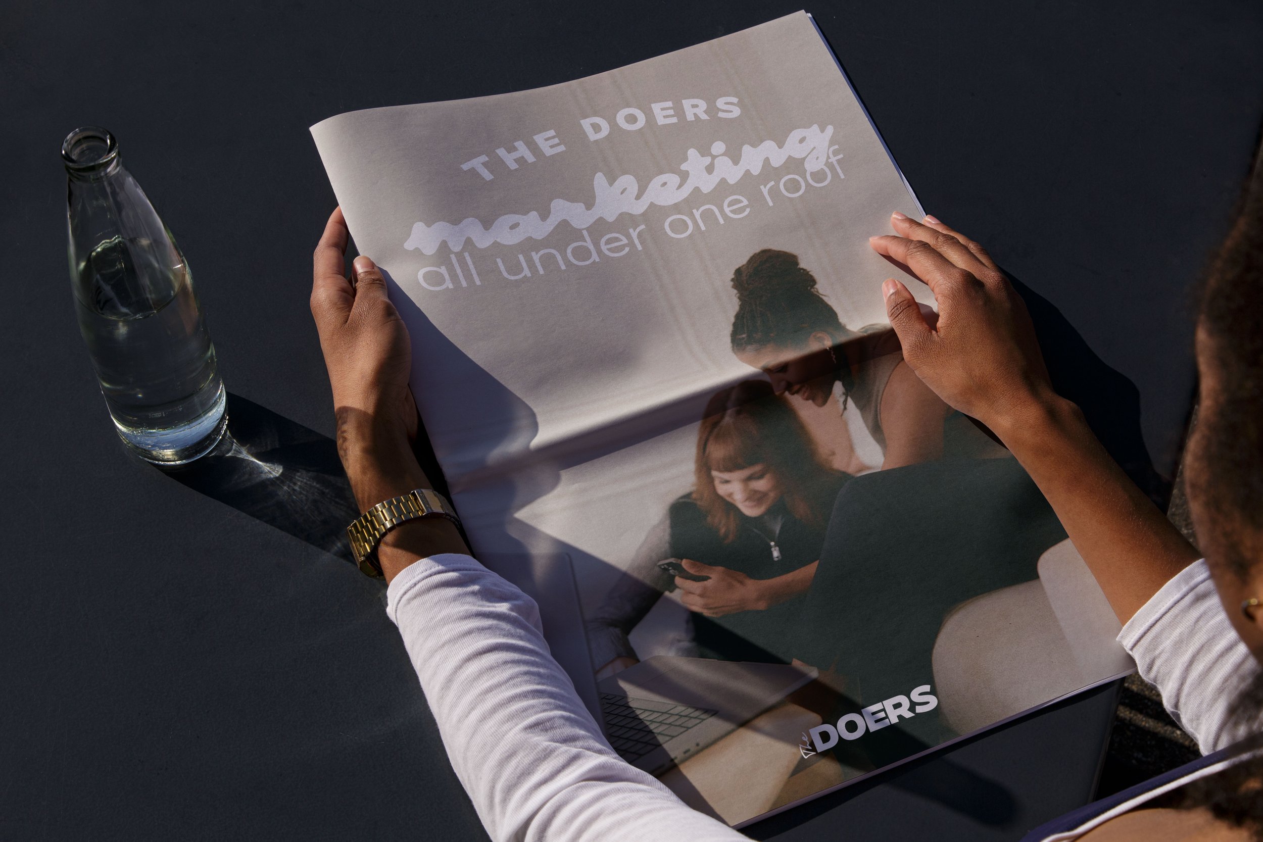
The Doers is a brand marketing agency made up of a community of creative freelancers. We give brands and businesses (both little and large) flexible access to the whole spectrum of marketing and commercial skillsets.
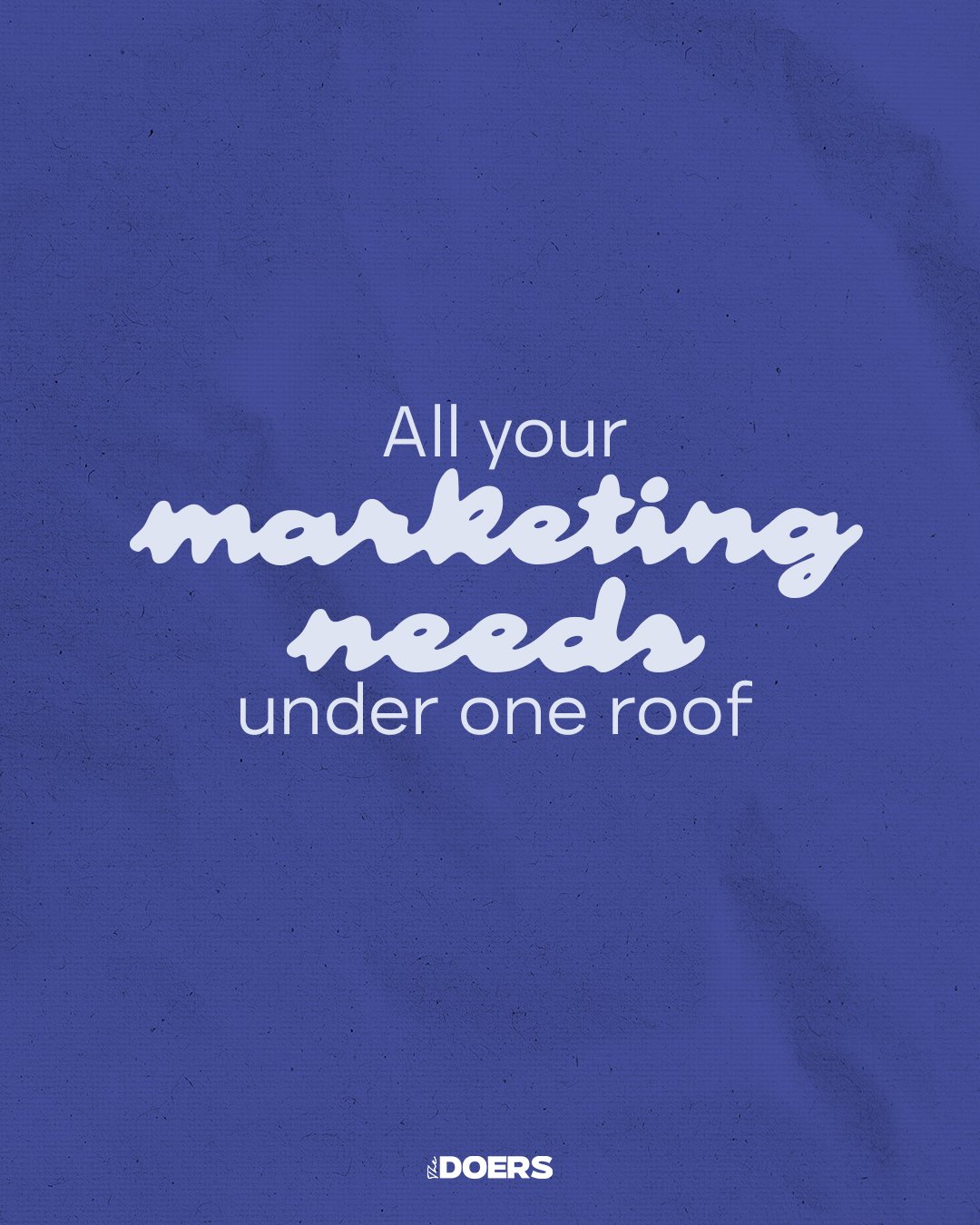
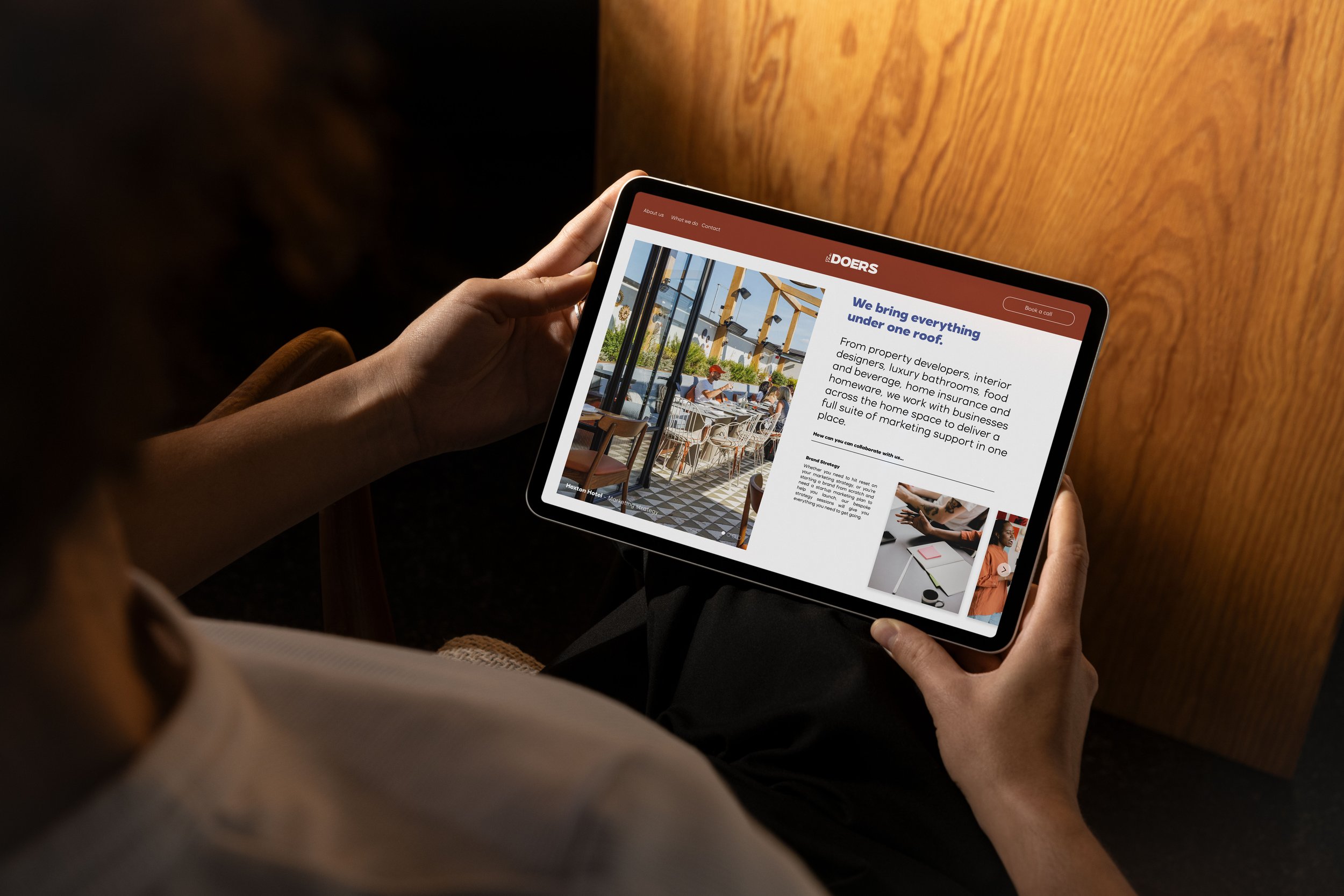
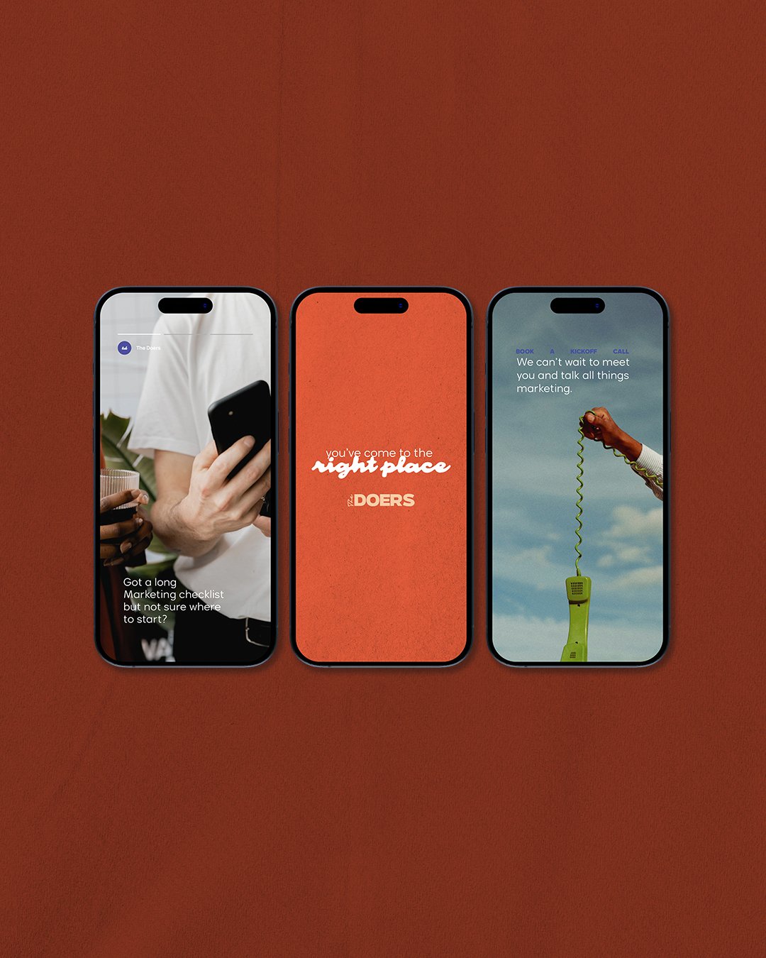
All your marketing
needs under one roof.
I was honoured to help The Doers, a marketing agency who help brands connect with freelancers to fulfill their marketing needs, to re-brand.
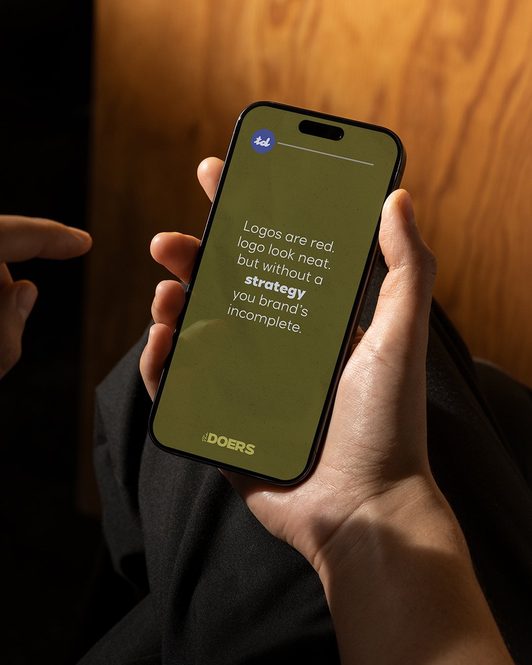
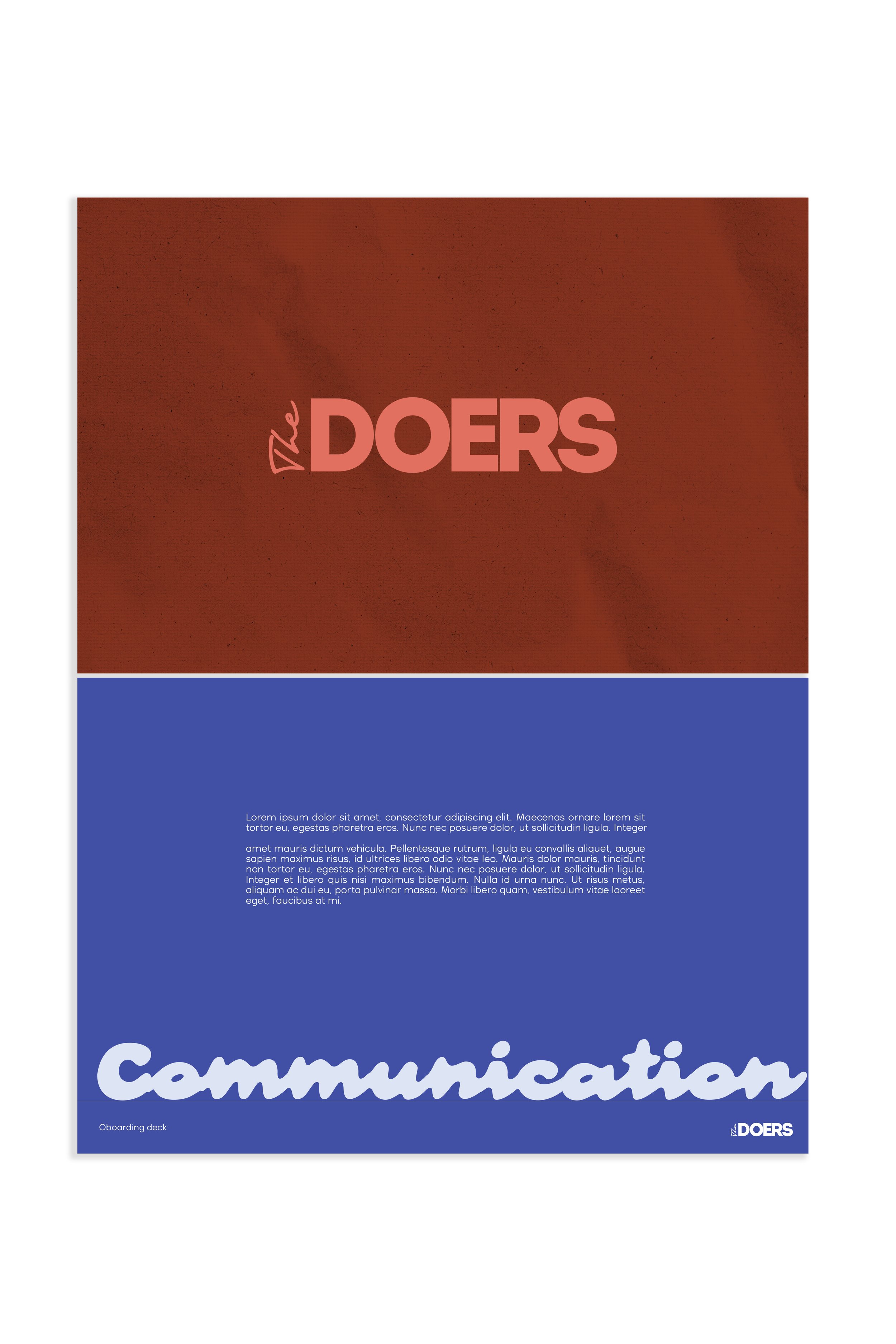
It was important to the founder that there was an element of ‘human touch’, personality and connection yet professionalism. We re-worked the brand image with this in mind and finally settled on an aesthetic which includes textures, handrwitten fonts, impactful colours and sets them apart from their competitors.
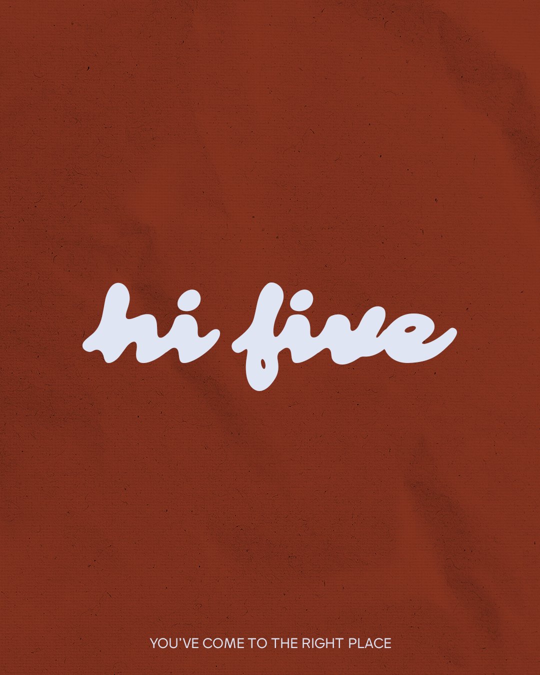
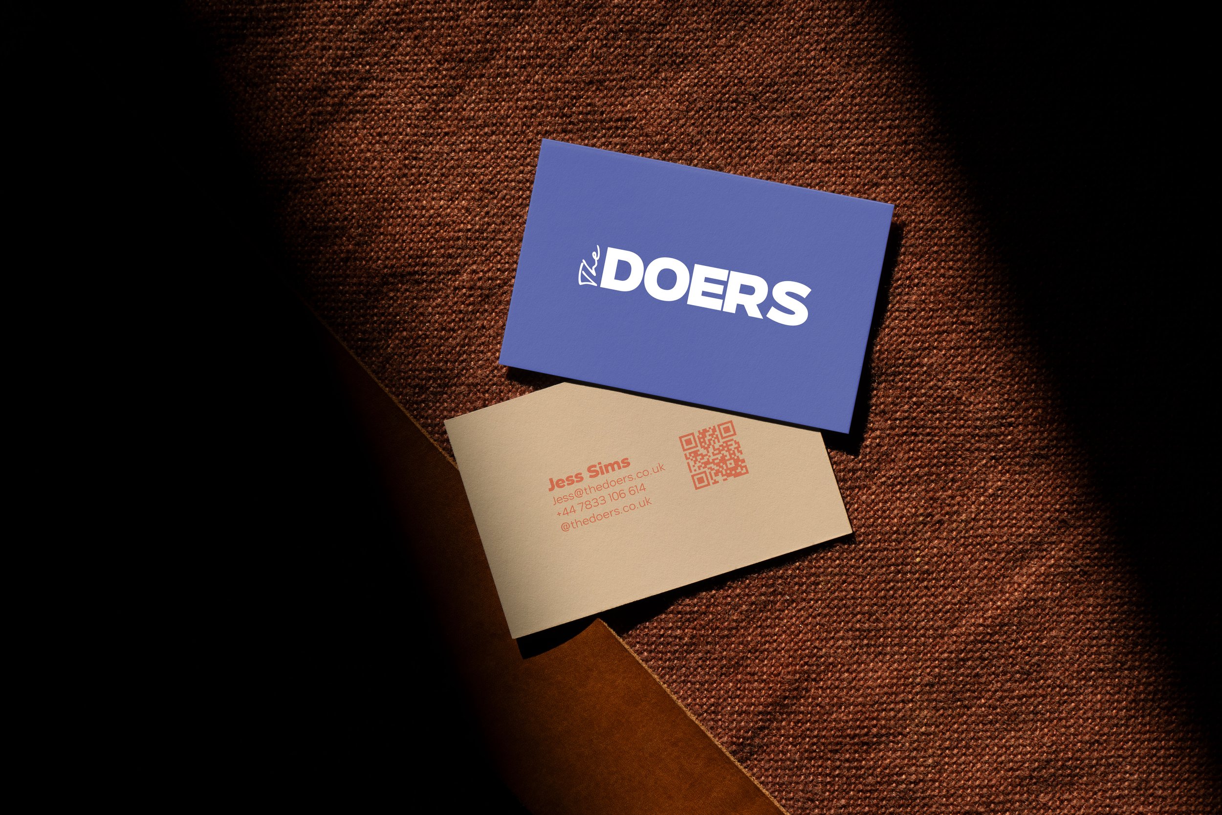
The logo
The logo effectively addresses the brief by incorporating a human touch through the use of a handwritten font. This adds a quirky, personal feel that complements the more structured typeface used in the rest of the logo. As a result, it stands out while remaining versatile and easily adaptable across different channels.
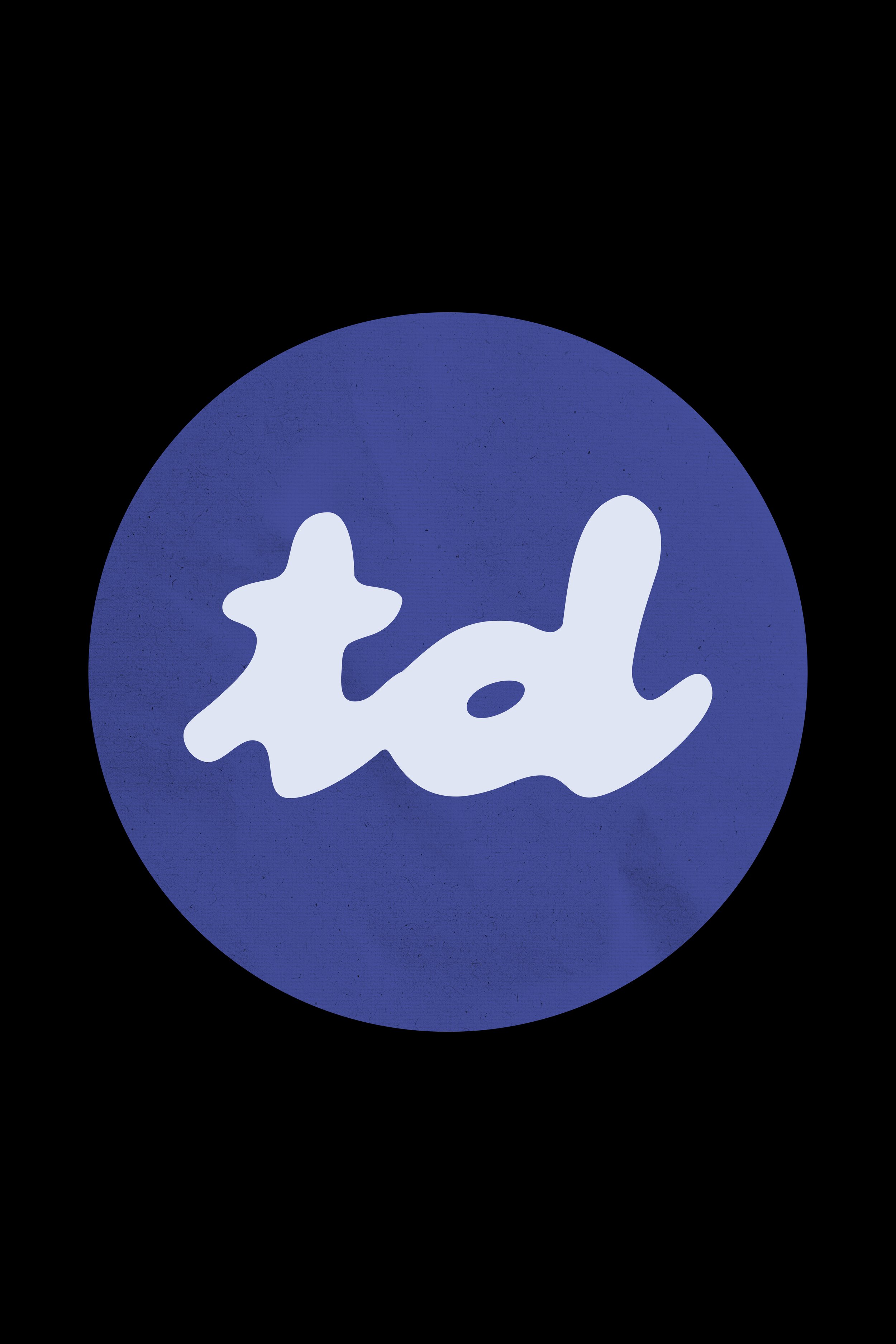
The sub-logo was formed from our accent font. Although simple, it embraces the playful personality of the brand and is useful for socials, favicons and various other digital needs.

Typography
We explored a wide range of typography on our journey, experimenting with both serif and sans-serif styles. The founder was keen on creating something distinct from competitors, aiming for a truly unique look. As the process evolved, we embraced the idea that less is more, ultimately narrowing it down to two complementary typefaces: one clean and highly legible for both print and digital use, and the other more playful and distinctive, designed to become a defining element of the brand’s aesthetic.
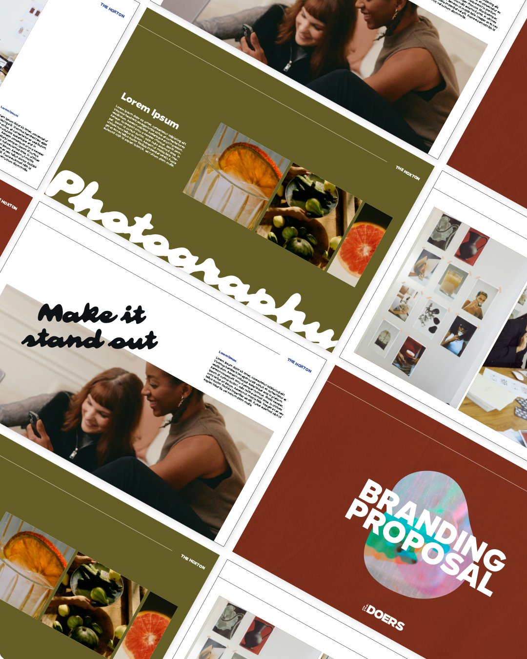
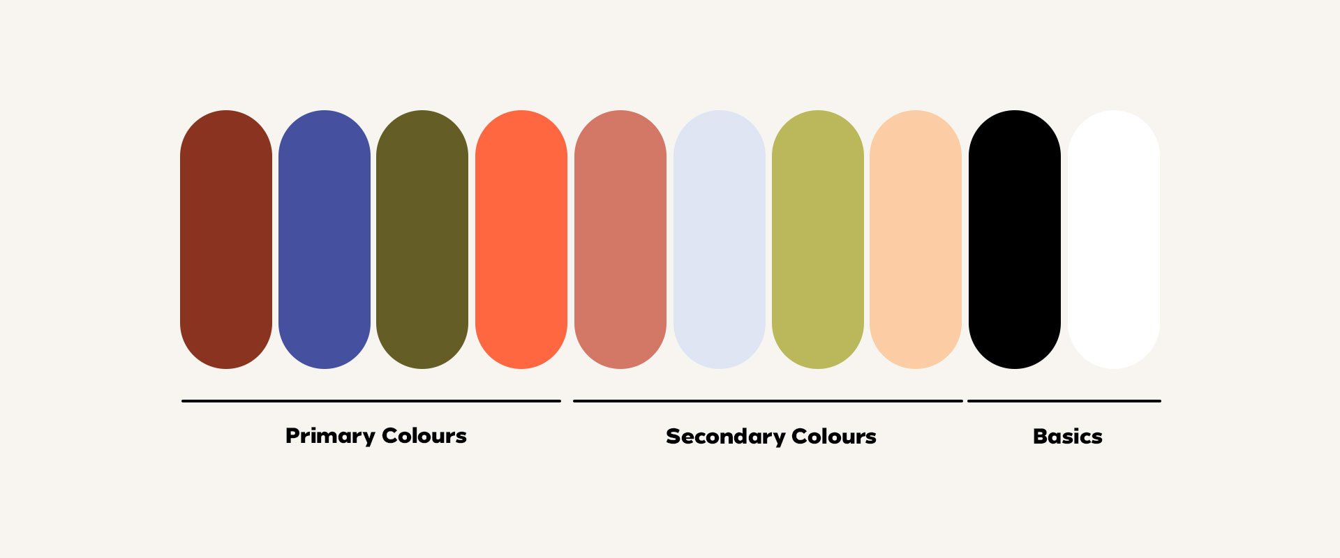
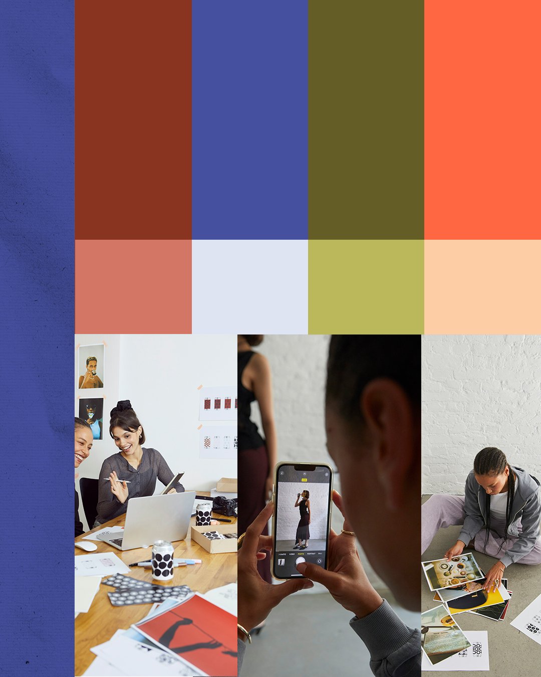
Colours
Typically, I work with a colour palette of 4–6 tones, but in this case, the client was passionate about incorporating a wider range of variations to enhance their presentations, social content, and overall brand vibrancy. It was important to strike a balance capturing the brand’s personality while still appealing to their largely professional, interior design-focused audience.
With that in mind, we introduced deeper, more luxurious tones into the primary palette to reflect sophistication and credibility. Brighter accent colours were added to inject personality and energy, used more sparingly to ensure the brand maintains a polished, professional presence while still feeling approachable and distinctive.
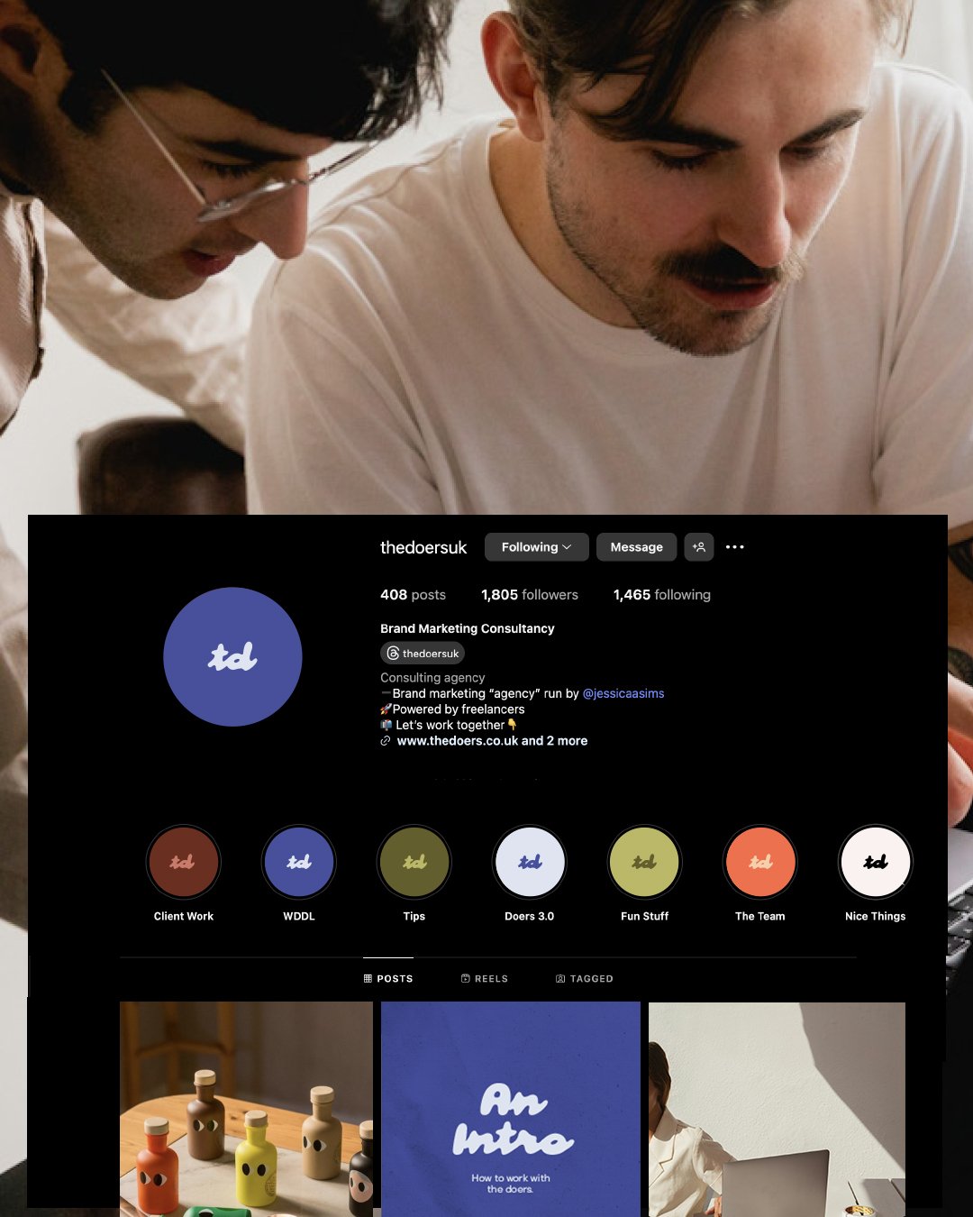
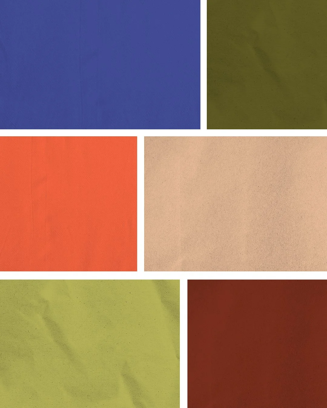
Textures
To further enhance the ‘human touch’ of the brand, we introduced 3 paper textures in 8 of the colour palettes that evoked a scrapbook-like, handcrafted feel. It was important, however, to define their use clearly within the brand guidelines to avoid the risk of the identity feeling cheap, overly rustic, or immature. By limiting these textures to specific applications such as presentation decks and social content and using them in moderation, we were able to retain their warmth and personality without compromising the overall vision of a refined, professional brand