-
Brand identity
Logo design
-
Imaura is a female-focused fashion brand whose mission is to create well-made, affordable clothing that strives to be more than fashion, building a community around sustainable fashion, muic, art and culture.

When creating this logo, the key takeaways were that it needed to be contemporary, Bold and Functional. With this in mind I designed a bespoke font with modern rounded forms and an icon which would be used as a sub-logo on clothing, accessories and across marketing.

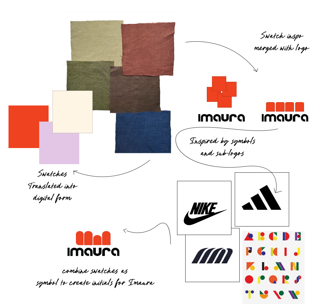
After examining the processes in making the garments I was inspired by the fabric swatches supplied before production which are a key aspect to Imaura’s brand in-keeping with their sustainable mission to embrace naturally formed fabrics. Using the square shapes to represent different swatches I built on the idea, inspired by iconic symbols and typography made form shapes to form the ‘I’ and ‘M’ by elongating the forms and rounding the tops to reflect the modern san-serif font. This led to an icon which could be used as a sub-logo and eventually be recognised on it’s own just like Nike uses’s their iconic Tick symbol.


The colour palette has to be
“Bold and striking to turn heads”
It was a no-brainer to me to use orange as a primary colour for this brand. Often seen as a confident, fun and creative tone which is everything Imaura encompasses. As a female clothing brand I wasn’t afraid to use a feminine shade which complimented the orange as well as a cream which softens the intense colours and balances any composition.


